Better story-telling
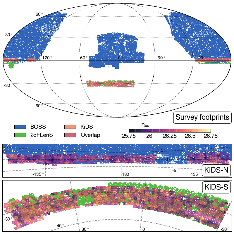
Data visualization has always been a key component of my work, whether in academia or industry, as it enables clear story-telling and effective communication of complex insights.
My expertise in data visualization primarily focuses on creating interactive workflows that allow users to dynamically highlight the most relevant information within customizable contexts.
Sometimes, this could involve minimal data processing using basic machine learning techniques, such as clustering, PCA, nearest neighbors, or ridge-finding.
Tools
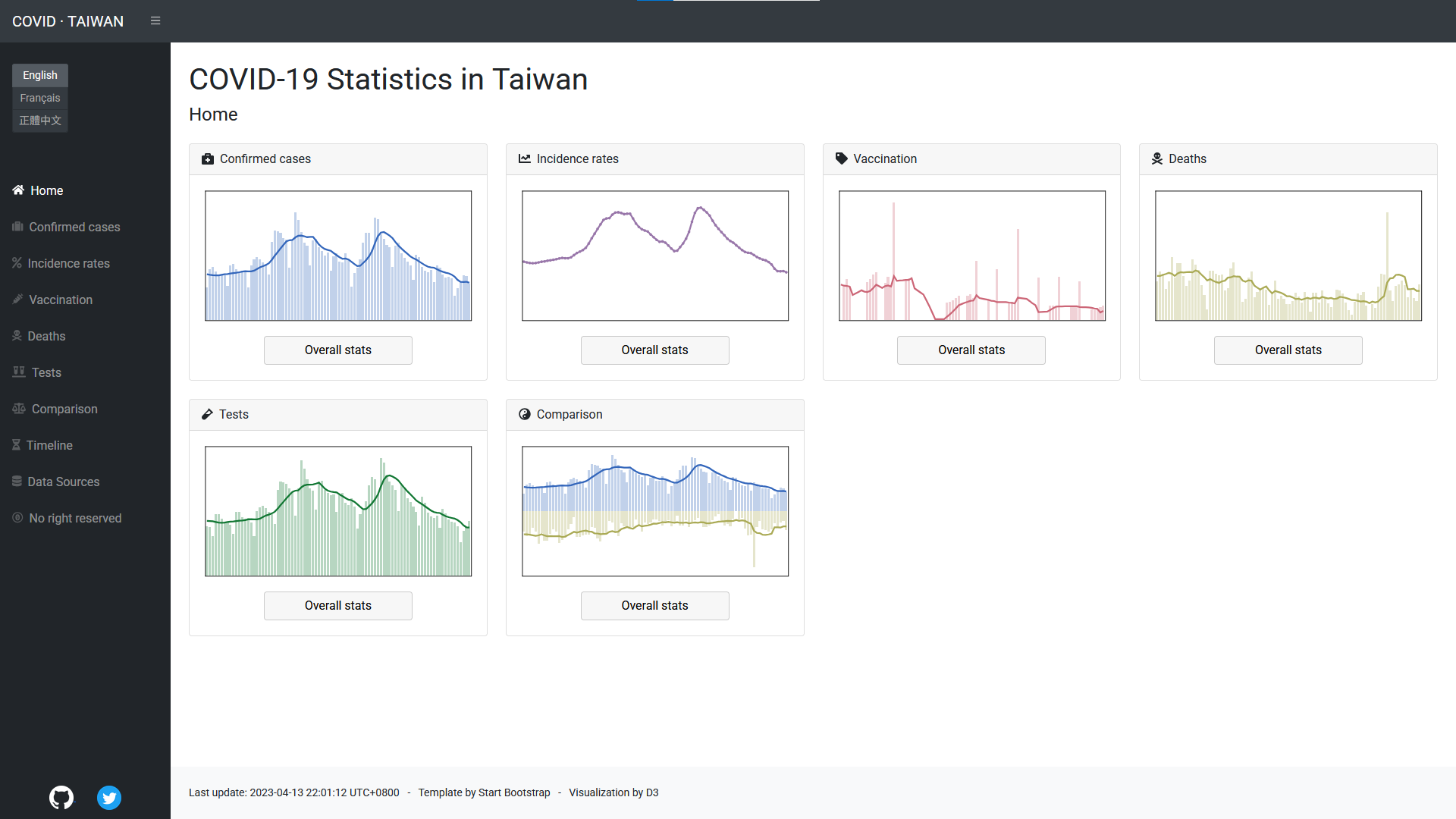
While I primarily use Python's Matplotlib package for most of my work, I also have experience developing an interactive dashboard using D3 to visualize COVID-19 statistics in Taiwan.
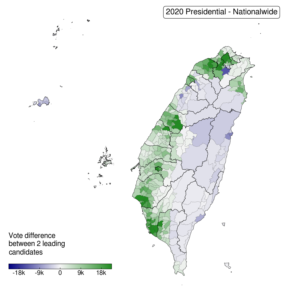
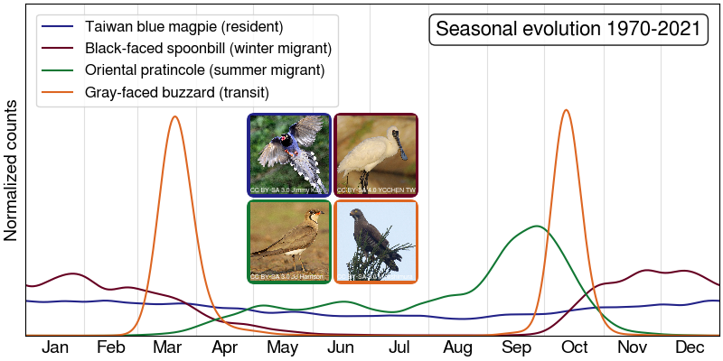
Outside of my professional roles, I often engage in personal data visualization projects. These include collecting and analyzing data on topics of my interests, such as electoral trends, ornithological patterns, and more.